- Select a bold, exceptional shape. The Spotify app icon is a good example. Only two colors are used and have a simple shape, which makes it easy to recognize and remember. The black lines inside the green circle symbolize speaker volume. It is a music app, and you can immediately identify the app’s purpose.
- Avoid using an image. Simplicity at its best. You may only add letters or initials to make it simpler. If you want to use a photo give it a twist or add style to make it more appealing to the eyes.
- Don’t put too many colors and details on the icon. The Snapchat app icon is a good example. It is simple and only used three colors. Adding too many colors or details will affect your app from standing out.
- Don’t put words. The Facebook app icon is a good example and fair enough to draw people’s attention. You have to consider that your app icon is going to look small on a smartphone screen, it will not be clear or readable if you add words to it.
- Add a border on the icon. The Adobe Photoshop Express app icon is a good example of an effective border. It is still simple but added more impact which makes the icon stand out in the Google Play or Apple App Store. You may want to create 3D effects but be careful about adding colors and details.
- Check your rivals’ app icon ideas. An example is the email apps. You may want to check the different colors and designs they used. You can select the color that is perfect for your brand and make it catchy for the users to download it.
- Create different app icons for more choices. Give yourself a lot of options to consider before finalizing your app. It will be easier to decide which one is the best and possibly attract users to download the app.
- View your icon on a phone screen if it is attractive or fits well before you finalize. Consider trying to look at your app design on mobile devices if it is good on light and dark backgrounds. You may want to change it if it doesn’t look clear and hard to recognize.
- Make sure your app icon has the right size. Make sure the size is proper when viewed on-screen to avoid refusal. The Apple App Store has their sizing guidelines and you need to follow them for your apps to be accepted.
- A/B test your app icons. If you’re releasing your app on Android, you can merely use the Google Play A/B testing feature. And for iOS or on another app store, try A/B testing your app with your Facebook audience – it’ll require you to spend some money, but being more educated is what matters.

Graphic Designers, Web Developers, Small Business Owners, Mobile App Developers and many professionals use icon makers like ICONPRO to create awesome and powerful icons.
FEATURES are:
- Custom Icon Maker
Create custom icons easily without Photoshop! Our tool allows anyone to create professional-quality icons for websites, apps or print. Make favicons faster with iconPRO!
- Make Icon Sets
Batch edit icons to match brand colors, shapes and sizes. Make uniformly scale and designed icons in a snap!
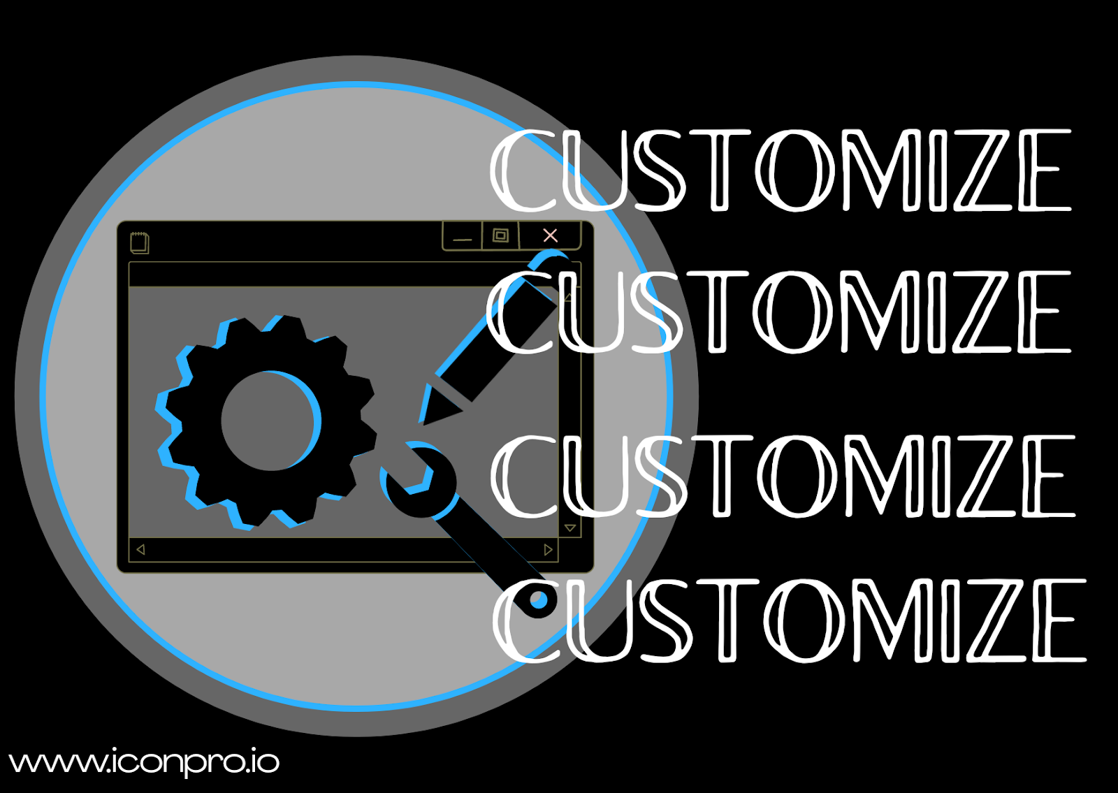
- Customize
Create stunning icons by quickly adjusting size, shape, background, color gradients, shadows and lighting.
- Icon Formats
Export Icons to SVG, JPG, ICO or PDF. Export in a variety of sizes/scales. Save your icons for later for quick access or edits.
Register now for FREE and start making your own graphics.