Making a beautiful and thoughtfully designed icon set that is clean and concise can be challenging. Here are 5 tips from expert icon set designers on how to make a set of your own.
Icon set design is useful when you are in need of a group of icons that all are uniformly designed and consistent with your brand’s style. Icon sets are often found on packaging when multiple features are needing to be expressed. An example of packaging icon sets would be a laundry detergent bottle that needs 3 icons to show that the product is Eco-Friendly, High Efficiency and Dye-Free. In this case, we might use a few icons like these to indicate those features.

An icon must clearly convey a simple visual message. A good icon transcends the language barrier between different groups of people and is universally understood. Icons are often used when it is essential to quickly communicate an action, object, process or application without words.
An Icon Set That Works Together – Stays Together
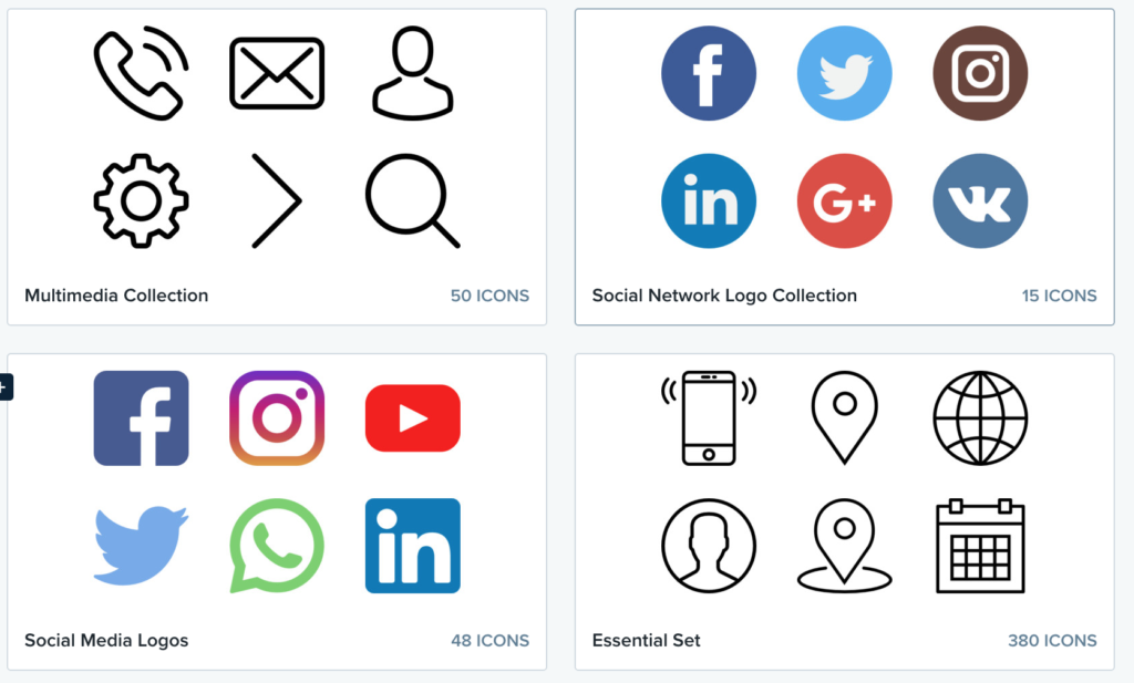
An icon set should be designed with visually similar features. If the edges of one icon are crisp, the edges of ALL of the icons in the icon set should be crisp. If the edges of an icon are soft, the entire icon set should have soft edges. Colors should also be visually similar in a high quality icon set. Usually only a few colors are used for most effective icon sets. Less colors means the icon itself must be high-contrast. Remember, it is extremely important for your icon set to instantly be recognizable. Icons in the icon set should easily be distinguished from one another.
KISS, Refine and Repeat
Keep your icon set simple and to the point. Make sure that together your icons convey a specific theme or style. The idea is to have the least amount of visual input convey the most amount of information. Using an icon generator like IconPRO can help you in the design process by keeping things simple and to the point.
Refine your icon set until you have reduced it to the most basic elements. You may start with more complex ideas or icons that represent what you are trying to achieve. Iterate several times through your icon set and ask yourself, “Could this be made simpler?” and “Do I need this extra piece of visual information? Is there an easier way to display this with less on the page?
How does IconPRO Icon Maker work? Oh let me tell you how!
Here is another interesting article on designing icon sets: