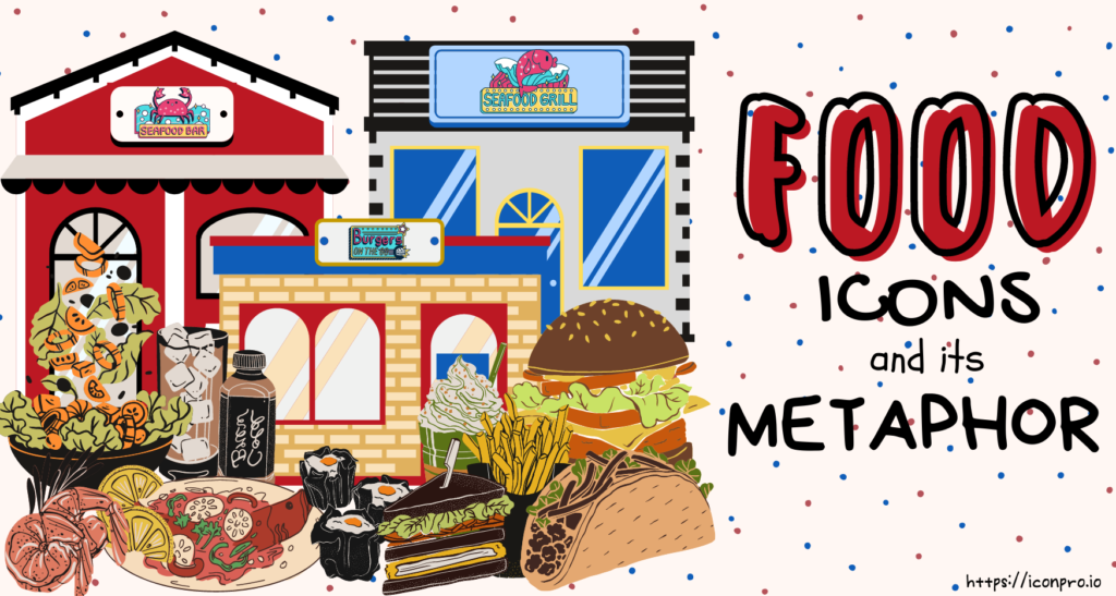
Food icons, as conversational tools, can be utilized for a variety of objectives, both personal and cultural. Food signs are also commonly used in marketing, advertising, and brand logos. Restaurant and fast-food chains have a specific food logo, such as:
- Burger King – is one of the world’s largest and most well-known fast-food companies. It has been cooking and serving excellent burgers since 1954. To encourage more people to visit their place, they proudly display their brands on billboards and signs. It is a tilted spherical shape with bun halves on both sides, and the font is written in the center, displaying the complete design. The Burger King logo is made up of two colors: yellow-orange, and red. The font chosen in the Burger King logo represents clarity and simplicity that makes it an ideal character to make it a powerful icon. Its revolution from different designs over the years has undertaken an aggressive marketing approach and made it achievable and successful until today.
- Red Lobster – the history of this famous company started as a single, family-owned restaurant in Lakeland, Florida in 1968 and it continues to grow until today with 700 branches around the world. The logo evolution of Red Lobster depicts how much it evolves over the last four decades. The logo has three colors: red for the lobster image that shows their passion for giving high-quality seafood, black for the background, and white for the font. Catchy and easy to recognize.
- Long John Silver – is a fast-food restaurant chain in the United States that specializes in seafood. It started in 1969 in Lexington, Kentucky, and the rest is history. By just looking at the story timeline, you see the progress and popularity for 52 years and still hitting the limelight. The name of the brand logo is derived from Robert Louis Stevenson’s novel Treasure Island, in which the pirate Long John Silver is one of the main protagonists. The brand logo has three colors: blue, yellow, white. The blue is the background, the font is white, and the yellow is the fish icon. You can easily predict what the company can offer. Simple, bold, and appealing.
Burger King only used two colors while the Red Lobster and Long John Silver used three colors. They didn’t put too many colors because it can ruin the brand and credibility. All are detailed and they stand out to the crowd.
You do not need to hire a graphic designer or be professional to create an icon. Using an icon maker is enough to meet your business needs. If you take a look at the following links:
Tips on Making a Powerful Icon
you will realize that you can make your icons in minutes for your website, brand, and mobile app. If you need to prepare for your work presentation and want it to be more engaging and appealing, you can choose from the library. It provides thousands of different icons, and even backgrounds and fonts are available. It is faster than photo and design software like Photoshop and GIMP. Try it now and GET STARTED FOR FREE.